


Part 1. Power to the People: Democratizing Data
There are three essentials to manufacturing analytics: start off with the right data, apply smart algorithms that can extract meaningful results, and then present them in a usable form.
It takes considerable effort, expertise, and investment to get all the way through the first two. However, if you don’t get the third part right, everything you’ve invested in the previous steps will come to naught, because people can’t act on results they don’t understand. It’s worth taking a deep dive into this third aspect.
The raw production data that we start with — much of it continuously streaming in from IoT sensors — is highly technical and mostly composed of numeric values. This is not a problem for data scientists and statisticians: that’s what they’re trained to understand and interpret. But not everyone is a data scientist. The audience for analytics results is often non-technical: machine operators and production managers. The data specialist needs to do the interpretive step for them, and present the analytics results in a way they can visualize and use to take action, such as raising or lowering a temperature setting.
Put another way, data needs “democratizing” to make it friendly and digestible in order to promote actionable change. There isn’t only one way to do this; one set of data can produce many pieces of information. That is, the same output can be translated in different ways for different people. In fact, it needs to be, because various people will utilize the output to accomplish different goals. Consider this example of four visualizations based on a single analysis of a production line in the Food & Beverage manufacturing industry:
An operator of a milk fermentation tank wants to know exactly when the process will be done so she can drain the tank as soon as possible. The fermentation process runs somewhere between 16 and 20 hours and the operator needs 20 minutes’ warning before draining time.
In contrast, a line or plant manager wants to monitor progress to see if operators are doing their jobs: specifically, whether they’re viewing the analytics output and using the insight to alter set points during runs.
A financial analyst, on the other hand, is interested in throughput optimization. Her objective is to ascertain how efficient production is or isn’t, and link the associated costs — for example, $1,000 for every minute a given run goes over its optimal elapsed time. Accordingly, I’ll create a display combining cost and process data to show what was lost or saved.
A process engineer needs to monitor everything—all the intricate details of the models and diagnostics—in order to assess the health and performance of the algorithm and determine whether refinement is needed, and, if so, in which areas. I’ll create a separate visualization for her, using multiple charts and tables.
Multiplying the Value of Production Data
That’s four different interfaces for four different types of people, all based on the same data and the same model. To engineers like me, this is really neat: we do an analysis just once, and get four times the value of production data. The trick is tailoring views for each user and removing “clutter” or irrelevant information… which, of course, is different for each role. I have to think about each person’s responsibilities and workflow, and then show them everything they need to know and nothing they don’t.
On the face of it, tailoring visualizations in this way seems simple and logical, and the payoff is certainly compelling. Why, then, is this done so infrequently? Well, it’s because those who create analytics generally aren’t trained in making information usable and friendly.
This has to change. To achieve more and better business results with sophisticated analytics, the output needs to be humanized so production-centric people can apply it to solve real-world problems.
That’s what Design Thinking is all about. Let’s go on to Part II and explore its principles.
Part II. Making Your Data Make Sense: The Principles Of Design Thinking
Design Runs Deep
Everything you’ve ever looked at, if it didn’t grow out of the ground, was designed. That means it was deliberately crafted. Someone sat down and made conscious decisions as to form and function.
An obvious example is the computer mouse. It’s engineered based on ergonomic guidelines: it fits the average person’s hand, it’s comfortable, and its movements correspond in direction and distance to what the cursor does on the screen. The motivating concept is “human-centered design,” the idea that a human being will be using and interacting with the device.
Most of us know that human-centered design figures into manufacturing and assembly. We can and should do the same for products that aren’t physical, like data visualizations and dashboards. However, design principles for the latter are very different. As observed in Part I of this piece, it’s unlikely that people in the manufacturing industry have much training in design thinking for intangible artifacts like data output.
Getting real value out of manufacturing analytics depends on putting the results into a form that non-technical people can understand and work with. Data analysts need to get familiar with well-established human-centered design principles that go into creating software interfaces and intuitive, easy-to-follow user experiences on devices like laptops, tablets, and cell phones. There’s no need to reinvent the wheel; plenty of explanatory material is already available. Here are a few principles to start with. You’ll find many more in the resources listed at the end of this article.
Design Thinking 101
At its core, design thinking revolves around two ideas: the fact that our brains are better at processing some types of data than others; and the need to tailor information to the mindset and demands of the people who will use it. Data experts can pull insights out of complex statistical presentations, but non-experts can’t. You have to show them concretely what they need to know. For example, if an operator only needs the time stamp at which a process finishes, just show her that and nothing else.
Gestalt Principles
These are a set of findings that describe how people generally seek order amid disorder by making sense of visual stimuli around us. We tend to group similar elements, discern patterns, and simplify complex images. Designers engage users by employing these natural principles of perspective and practice, which include:
Figure/Ground Articulation. Unless an image is very ambiguous, our eyes gravitate to the foreground first.
Proximity Principle. We tend to group items that appear closer together, distinguishing them from elements that are farther apart.
Closure Principle. People automatically fill in gaps between incomplete elements with a definite shape, so that we see the whole first.
Common Fate Principle. This intriguingly-named tenet says we group elements together if they move in the same direction.
Some Basic UX Guidelines
Make things simple and intuitive. Intuition isn’t conscious, so by making things easy to find, learn, and utilize, you’re eliminating superfluous mental effort and reducing the “friction” of the user experience. This is good: you want users to save their acuity for determining appropriate actions to take, prompted by your data.
The user may perceive things differently than you do. What’s obvious to you isn’t necessarily evident to someone else. Design data visualizations accordingly.
Have empathy. Try to identify with your users’ needs and understand why they do what they do.
Present a limited number of choices. Ever enter a supermarket aisle and find yourself overwhelmed by the sheer number of different toothpastes on the shelves? Don’t do this with data dashboards. Omit “nice to haves” in favor of the “must haves” a user needs to perform the actions within their specific domain.
Create a visual hierarchy that maps to the user’s needs. Orchestrate elements such as color, size, position, contrast, and grouping to mirror the way things are ordered in your audience’s real-world frame of reference.
Analyze This: Visualization Examples
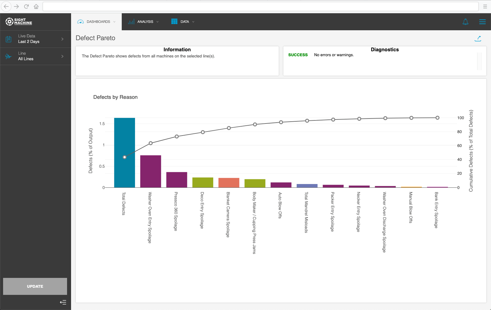
- Line Manager: Defects Breakout
This visualization is tailored for line managers, who want to see the various kinds of defects found during the previous day’s runs so they can know exactly what needs attention.
- Operator: Fermentation Status
This is a snapshot of a screen that shows the operator where five respective fermentation tanks are in the production process. Color-coding makes operational status discernible at a glance. Red means you’ve already missed the end of the run. Yellow tells you the process has less than 20 minutes remaining, and green indicates that the process is running with more than 20 minutes to go. Specifics are shown in hours and minutes.

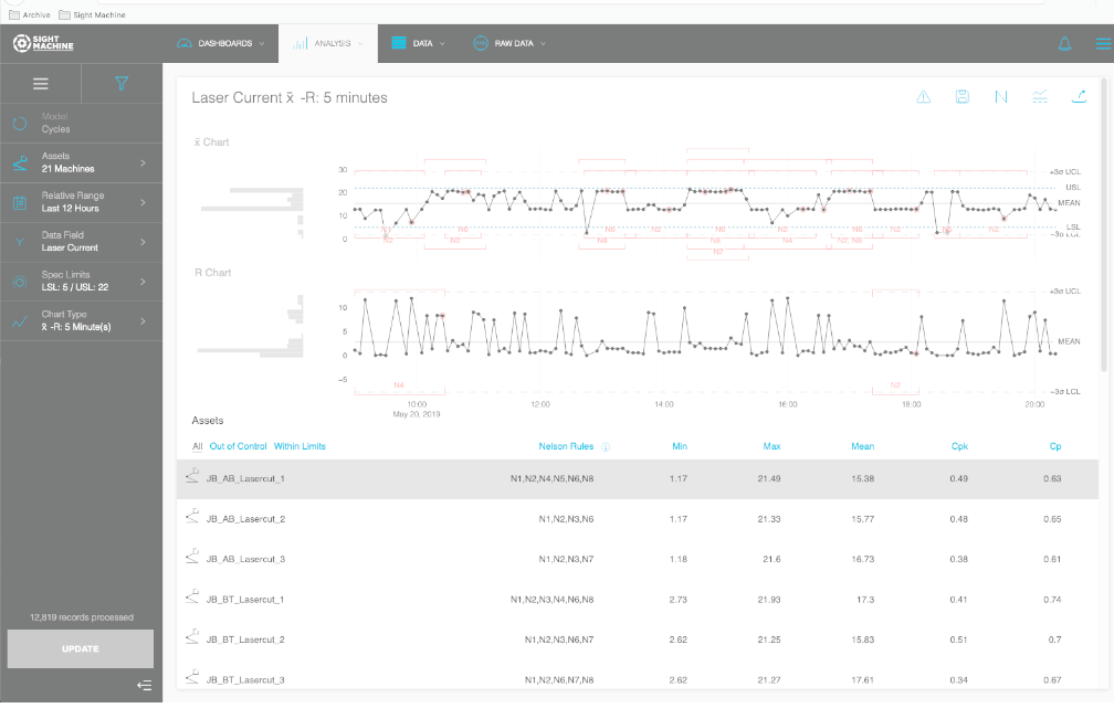
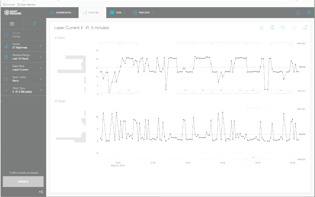
- Sight Machine Statistical Process Control Interface
These are examples of the statistical process control interface available in the Sight Machine platform right out of the box. The value of production data in the table is the same as shown in the charts. The user has the option of including the table or hiding it, as in Chart B. If the user doesn’t need all 8 Nelson rules, they can eliminate clutter by hiding everything except the one they want to see.
Design similarly when creating your own algorithms and interfaces from scratch. That is, build in some customization options to let the user tailor the output to be most beneficial to them.
Variant A
Variant B
Helpful Resources
- https://whitneyhess.com/blog/2009/11/23/so-you-wanna-be-a-user-experience-designer-step-2-guiding-principles/
- https://www.interaction-design.org/literature/article/preattentive-visual-properties-and-how-to-use-them-in-information-visualization
- https://www.thoughtco.com/elements-of-composition-in-art-2577514
- https://www.scholarpedia.org/article/Gestalt_principles
- https://dl.acm.org/citation.cfm?id=22950
- https://research.tableau.com/sites/default/files/p110-mackinlay.pdf
- https://courses.cs.washington.edu/courses/cse442/18au/lectures/CSE442-Perception.pdf
- https://www.goodreads.com/book/show/1408452.Information_Visualization
Please contact us for a live demonstration of how Sight Machine’s AI-driven platform and CI services can achieve the true value of production data.


